
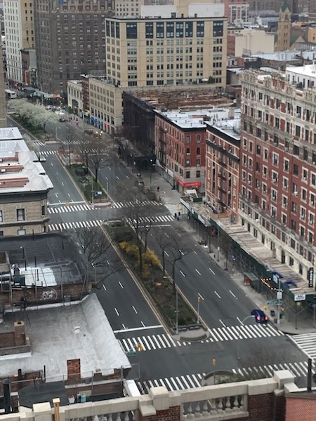
A not-so-bustling Broadway at rush hour. Photo by Jack St. Mary.
The city has begun releasing zip-code-level data on the number of positive coronavirus cases. Upper West side zip codes have clearly been hit hard by the virus, with hundreds of cases in the neighborhood.
The Times put together the zip code data and the UWS zip codes are below:
zip code number of cases cases per 1,000 residents
10023 190 4
10024 204 4
10025 252 3
These numbers have been updated after the Times changed their numbers and issued a correction. The stats show they are less than the average for the city, not more.
The 10069 zip code, which includes the area next to the Hudson River below 72nd, does not show up in the Times’ tally.
With 47,439 people having tested positive in the city as of Wednesday (out of a population of 8.6 million), the citywide positive case rate is about 5.5 per 1,000 people. The Times notes that poorer parts of the city have been hit harder, on average — perhaps because more people are living in smaller apartments.
There are also important caveats to all of this. For one thing, testing is still reserved only for people suffering the most serious impacts of the disease. Many people who have slightly less serious symptoms are not getting tested, in order to preserve resources for the sickest patients.


Maybe we could try a randomized sampling to get a truer feel of the case rate per 1,000?
The poorer parts of the city have also been hit harder because many of them have to travel long distances on public transportation to get to a job.
Please people of New York as we keep ourself clean
And sanitized we need to keep our streets clean as well stop throwing paper and garbage on the floor we don’t need the dirtiness of the city that will not help our situation please keep the streets clean in front of your buildings we see a piece of paper pick it up if you have a glove but please let’s try to keep the city clean look around you it’s Dirty.
I’ve noticed SO MANY discarded gloves and masks on the streets these past few weeks. Gloves are the new cigarettes. Its disgusting.
Gloves are worse then plastic bags, folks should be wearing paper gloves
And pick up after your dogs.
There was even dog poop in sheep meadow yesterday. The place I walk to for my daily outside time. Dogs aren’t supposed to be in there to begin with. So at least pick it up!! And this is coming from a vegan animal lover.
Larry K – I’ve also been noticing that more people aren’t cleaning up after their dogs. I guess with fewer people on the street they don’t feel guilted into doing it by watching eyes. It’s still disgusting, folks, so clean up after your dogs whether someone is watching or not.
Yes, folks, please pick up after your dogs. Pre-Corona I saw people diligently picking up the waste products from their dogs. Apparently no one is hoarding doggy waste bags, so you have no excuse. This is a health hazard!!!
I have a dog and have noticed this too. I have been picking up the poop of others as this drives me crazy. People aren’t paying attention, it truly is sad.
At 10:30 PM the Times website shows the same number of cases for the above zips but
10023 & 24 at 4 per 1000 and 10025 at 3.
When I had looked earlier it had the same per capita cases as you have above.
Which is correct?
Yes, it appears that the Times data was initially incorrect. We’ve made the updates.
NYT issued a correction:
“Correction: April 1, 2020. An earlier version of the table with this article showed incorrect values for the rates of coronavirus cases. The values given were for tests per 1,000 people, not cases per 1,000 people.”
If you combine their old and new data, it appears that, for example, for 10024, 11 people per 1000 were tested (old table), and 4 people per 1000 tested positive (new table). Therefore 36% of those tested, tested positive for coronavirus. And, according to another NYT article (https://www.nytimes.com/2020/04/01/well/live/coronavirus-symptoms-tests-false-negative.html), there is evidence that on average 30% of corona test results are false negatives. So the “real” number for 10024 may be 7.3 cases per 1000 (4 positive plus 3.3 false negatives). Meaning, 67% of people who are tested have it, and 33% don’t.
It seems that by the time you can get a test, it may already be too late, or at least a foregone conclusion. Best for all to behave as if we all have it or could give it.
The NYTimes article states that the infection rate in Zip Code 10024 is “4” per thousand, not “11” per thousand as the item above states.
11 refers to the number of tests administered in the zipcode. The reported infection rate is 4/1,000. The comment tries to estimate the proportion of those tested who test positive by looking at the proportion of people tested who test positive and then extrapolate that to an incidence,
you’re correct
Of course, none of this tells me whether the people who live next door to me, or down the hall from me, or in another apartment in my building, have been infected. Or, therefore, the extent of “deep cleaning” that may be required where I (or you) live.
These published statistics are superficially interesting, but only in an abstract way. They are not useful in deciding the degree of environmental threat you, or I, face, and therefore useless in identifying how to cope with that threat.
It was through the publication of those specific data, not identifying any individual but locating each specific case of infection, that allowed the people of Seoul — a much larger city than NYC — to get some control over the spread of the disease. At least you could have some sense of where safety lay.
Here, though, all we get are useless “isn’t that interesting?” numbers that give you no guidance whatsoever. Other, of course, than what you’ve known all along: This is just no place you want to be.
I don’t find the date useless at all. 4,5,6,7 per thousand is about half of one percent. Unless you’re going to hermetically seal yourself up for the next few months, you can assume that the collective practices and the way the virus is spreading have so far kept 99.5% of us safe. Even if that number goes up 10X, it’s still 5%.
Let’s just operate under the assumption that it is everywhere. That way we can all be super vigilant in maintaining our distance, washing our hands, and doing our part to slow the spread.
Any amount of “comfort” that it’s not immediately around us going to lead to a prolonged need to be sheltered at home.
I live in 10024, but because my husband is a New Zealander, we were in NZ when coronavirus hit and decided to stay here. The NZ instituted a country wide lockdown a week ago. It is working! Please stay home until you really need supplies. I wish you all well.
Does the current test show if one HAD the Corona Virus if they’re over it,,?
No — you would need a test for the antibodies — this one tests for viral RNA (a protein associated with COVID) — there isn’t a test fo antibodies yet. Or at least none of which I am aware.
No, but I understand there is a new test that does check for antibodies, ie, having had the virus not whether you have it currently. Don’t know any details.
The New Jewish Home is in 10025. Yesterday you reported about 20 COVID positives from that site alone which I assume is part of that zip’s numbers as opposed to the permanent home address of the nursing home resident. Some may be temporary residents, others permanent.
Perhaps one reason why the affluent zip codes have fewer cases is because the rich have fled the city.
It’s eerily dark at night in many “10023” buildings — something I’ve never seen in my 50+ years here.
The absence of figures for the “10069” zip code could also be for the same reason.
It’s because the people getting sick are blue collar workers who stock the shelves and supply us while we sit home in front of our laptops. And, their families in their crowded apartments.
We owe them far more than we can or will ever acknowledge.
Yes we are far less densely populated due to the fleeing of the runners. I’m really enjoying the quiet and the fresh air.
Out of the 10 apartments in my building only 2 have residents that have remained. It’s been very quiet here over the past 2 weeks.
There are ten apartments on my floor. Six are empty now and one of the remaining is a woman who has the virus and is quarantined inside.
I wish the city would outlaw spitting and start to issue fines. People are still hacking up loogies and spitting them in the park and on our streets. Some of this is due to construction workers still working. For many many years have thought the NYC Dept of Health ought o address this.
Spitting in NYC has been illegal for over 100 years.
Now take those numbers and multiply by ten and you might be close to reality.
How do the people who are presumed positive by their doctor but not tested show up in this? I have friends that have all the classic symptoms but were not tested. The doctors said unless symptoms get critical stay home and quarantine. Do the doctors report presumed positive?
I look at all the data on the NYC.Gov and multiple the positives by 4. Many aren’t getting tested anymore
I believe that you illustrate another reason why the numbers are so low in affluent populations. The affluent have primary care physicians (if not personal physicians) that they can call and actually dialog with. The physician tells them (as you write) to stay home unless things get worse. They isolate and are never reported.
Yes, we owe much to our blue-collar workers, including all those in medical settings.
This NJ map is really cool having daily updates.
https://datawrapper.dwcdn.net/vHySA/62/
I seems to infer that counties living closest to NYC and along the NJ Parkway are getting hit the hardest.
Can someone make this a project for NYC using Datawrapper?
Go to the bottom of this page
https://www1.nyc.gov/site/doh/covid/covid-19-data.page
to the Download Data section. There are links to several permutations of the data.
The graphs generated are great and they use Datawrapper to generate. The data provided is useful for seeing the same data in different ways. For example, you to could use a pie chart rather than a bar graph or a map for the groupings provided. You could show a map of boroughs using the free Datamapper product to show total numbers. It is slick and useful.
The Zipcode maps provided as a download in PDF really show the flaws in the reported data which you cannot see using a table.
The various zipcode districts have different areas. The map breaks down the zipcodes into categories that are different sizes and densities. A better result would be to show the density by square mile rather than a total number for a district. Even showing percentage of population would be better that how it is being displayed.
The map legend breaks down the data categories in different sizes. The largest concentration districts show a larger spread.
Referring to the map, zipcode 10024 stretches from roughly 72nd street to 125 street. One end of the district could have an entirely different density of cases. Comparing it to a zipcode in Queens with high densities shown on the map is deceiving considering that each district is of different sizes geographically.
Getting the data to correspond to fit into predefined districts of the same size is the next problem. There are many granular structures ranging from buildings, lot and block numbers, Election Districts, Assembly Districts, Council Districts, Boroughs, Counties etc. What do you use so that we are talking about the same thing? Its a dilemma for the modelers.
The final nail in the coffin is the data structures and how to view them. For the non professionals there is a free product called QGIS that can read many different data formats and graphically overlay them. This assumes they have been properly geocoded.
Breaking down the tasks of assembling data, different sources can generate data using their own maps which are compatible with each other. These maps can be used to show data overlaps of different densities and types.
The ESRI/ArcView Shapefile data format base maps are available at the OpenData site of the City of New York and other sources.
Using products like MS Access or MS Excel files from different sources can be populated with relevant data into the Shapefiles. Remember garbage, in garbage out.
A tutorial for QGIS is available at
https://multimedia.journalism.berkeley.edu/tutorials/qgis-basics-journalists/
@nycissues.org, If you are into maps, you may like this site too, which provide global data and stats:
https://gisanddata.maps.arcgis.com/apps/opsdashboard/index.html#/bda7594740fd40299423467b48e9ecf6
Of course, with the caveat that the data is only as good as the local reporting and testing.
More tests needed asap.
Another reason poorer neighborhoods hit harder is people with food stamps can’t get groceries delivered and are forced to go out for food. Not one city official has addressed this major issue yet. Welfare recipients CANNOT self isolate of quarantine.
At least one UWS co-op has decided to keep out any visitors remotely connected this crisis.
This includes a physician who came down from NH to work at Bellevue in response to the crisis.
https://www.nytimes.com/2020/04/03/nyregion/co-op-board-coronavirus-nyc.html?action=click&module=Top%20Stories&pgtype=Homepage