
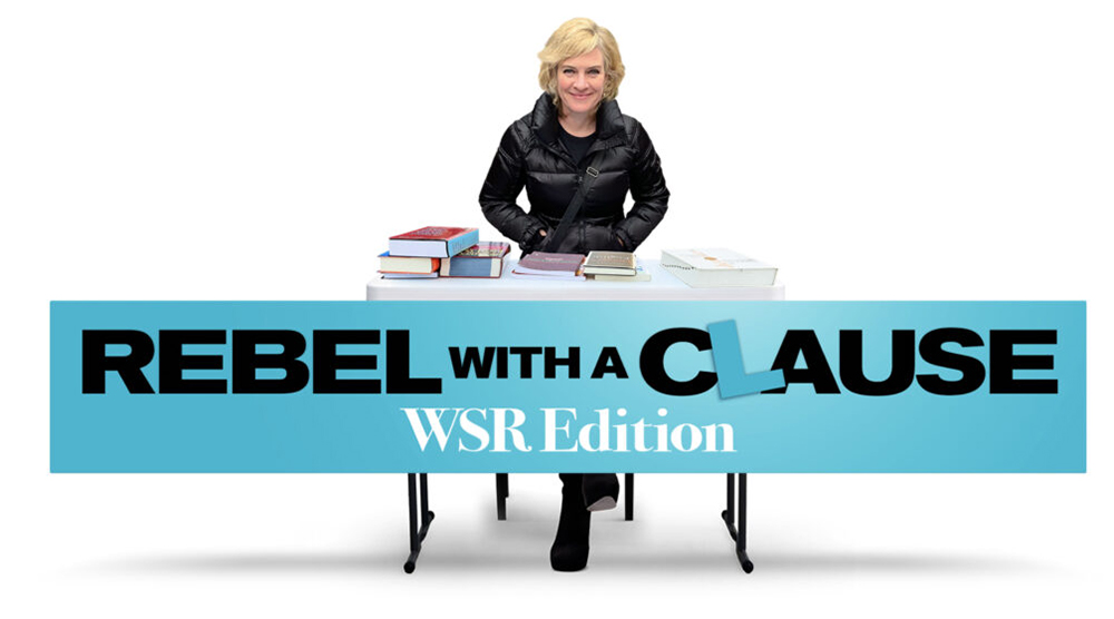
By Ellen Jovin
Because I have a grammar-advice stand, I get a lot of questions, many of which concern bad writing advice as well as, increasingly, questionable AI practices. Below are some recent highlights.
Q: I was taught never to use “I” in business writing, but I find it really hard to avoid in email. What should I do?
A: Please stop avoiding “I” in email. You have to use “I” if you are a regular writer of email. It is true that first-person singular is not appropriate in many business documents—reports, for example—but email is another story. Email comes from one person. That person exists in first-person singular, and no one can function effectively in business email while denying their first-person singularity. Many of the emails I have sent since the beginning of email time have begun with the word “I,” and I feel great about it.
Q: At some point I learned that you are not supposed to use contractions in work email, so I don’t. My co-worker uses them and says they’re fine. Who is right?
A: Your co-worker. Contractions are, on average, less common in formal writing than in informal writing, but you can absolutely use them in work email. In fact, I couldn’t live without them. Email is often a substitute for what would have historically been conversation, and the email ideal is to be professional and polished while also sounding like the human being you are.
I will sometimes even write out “is not” in one sentence and then contract it as “isn’t” in another—in the same email! You too can do this. Live on the edge.
Q: My colleague claims she doesn’t use AI at work. But then for certain tasks she will mention that she did use AI—because she ran out of time, or a task was too hard or boring to do it herself. But that means she does use AI at work, doesn’t it?
A: Yes, it does. People have a long history of denying all kinds of behaviors—drinking, smoking, extramarital affairs, etc. Now we can add AI use to that list. Your colleague may be relying on AI more heavily than she tells you. And she may also be in violation of company policy, especially if she is pasting confidential corporate content into public AI tools.
Q: My daughter’s seventh-grade language arts teacher requires students to use two spaces after every period in their homework and essays. She takes points off if they use only one space. I just want my daughter to learn things that will be meaningful now and help her in the future. I’m not looking for advice, because I can’t do anything that would cause trouble for my daughter at school. I’m just here to vent.
A: Please accept my sympathy. Naturally I agree with you. People are welcome to continue using two spaces in their personal writing, but it is not appropriate for teachers to insist on something for class that is no longer standard and that will be in pointless opposition to the one-space world their students are being prepared to enter. If your daughter’s teacher opened 20 of her favorite books right now, she would most likely find that they all have a single space after periods.
Some people will argue that it doesn’t matter. I think it does. A teacher should not add a pointless cognitive burden to lessons when students are supposed to be focusing on actually meaningful things. It is not helpful to have children waste time going back over essays and ploddingly adding two spaces, despite their lifelong habits and what they will have to do in the real world. They should be learning to love language, reading, and writing, and on that journey they should be able to trust that their teachers are open to educating themselves about the changes that inevitably occur in all of our lifetimes.
Q: I used em dashes in a job application. The company told me that was a sign of AI and rejected my application. But I didn’t use AI. I just happen to like em dashes.
A: That makes me sad. AI-detection software is known to make mistakes, and false accusations like this are a serious injustice. I support your right to use em dashes. I used em dashes in this story, I have used em dashes my entire adult life, and I am going to continue to use them whenever I feel like it. I hope you are about to get a much better job than the one you didn’t get.
Ellen Jovin is the author of the national bestseller Rebel with a Clause and the subject of a new grammar docu-comedy by Brandt Johnson, also called Rebel with a Clause, which you can see this holiday season at New Plaza Cinema on the Upper West Side. You’ll find a complete collection of her columns for the WSR — HERE.
Subscribe to West Side Rag’s FREE email newsletter here. And you can Support the Rag here.


Great advice! Especially concerning using the m dash, two-spaces-after-period rule, contractions in emails, AI usage, and the personal pronoun “I”. That about covers it.
Two spaces after sentence-ending periods should be the standard. Ending a sentence with a single space in professional writing is no different from using “IDK” or an emoji. On second thought, single spaces after sentences are an even worse offense because they make the text harder to understand.
Curmudgeon, your comment is displaying with a single space, as do all the books you and I read, and I still understood.
Ellen, the single space you see is due to the phenomenon I explained elsewhere: rendering HTML in a browser will by default* collapse multiple whitespace characters into one. Neither that nor the fact that the result is still understandable means it’s quality typography.
Oh, and I read OODLES of books in which the intersentence width exceeds that of a single space! I’ll bet you’re read some, too.
_____
*Ignoring such exceptions as the “pre” (can’t use angle brackets here, alas) tag, etc.
IDK, seems like a mild exaggeration that anyone but some octogenarian glitterati gives a hoot about it.
Ageist remark.
“Glitterati” is plural, and therefore its predicate verb should be “give”, not “gives”.
And I am neither an octogenarian nor a glitterato, but agree with Curmudgeoun in toto.
Take your time on this.
Professional copy editors get very riled up about this. When I took a typing class (in 1969, at age 13) we were taught to put two spaces after a period, and I have automatically done this ever since. Apparently with the introduction of word processing it is no longer standard (e.g. see https://www.grammarly.com/blog/punctuation-capitalization/spaces-after-period/), and a lot of copy editors don’t do it any more. Many people feel very strongly about how this should be done, one way or the other, both professional copy editors and the rest of us. (I’m in a facebook group of copy editors, that’s how I know how they feel about it.)
What the teacher should definitely not be doing is wasting the students’ time with fussy rules about it. And even less with a fussy rule that is no longer correct.
It’s you and me against the world, Curmudgeon.
Count me in. (And, with respect — particularly given the grammarian setting — that should be “It’s you and *I* against the world”…..)
I’ve probably been writing for longer than you have been alive. I’ve learned to change with the times. You sign yourself “Curmudgeon,” you don’t want to write as though you should be signing as “Fossil.”
That teacher is wrong, and I’m still fond of two spaces following a period. The “two spaces following a period” is a relic of FIXED PITCH fonts, such as the Courier standard on the majority of typewriters before the 1980s. Every letter, space, and punctuation mark was allotted the same width as a key was struck and the paper advanced. So a capital M was just as wide as an exclamation point! Placing two spaces at the end of each sentence clarified where the sentence ended.
This practice became moot when the “golf ball” style of typewriters had their moment (ah, the IBM Correcting Selectric II, so dear to my heart). Suddenly, a typewriter was smart enough to use a PROPORTIONAL font, like commercial printers do! That moment was rapidly superseded by our frenemy the computer and its word processing programs. Nobody chose Courier or other fixed-pitch fonts when there was a Univers (my pun) of proportional fonts available. Since proportional font letters took up a variable amount of horizontal space according to their needs, the Space did not need to be doubled to indicate sentence endings.
Excellent explanation, M.J. After graduating from a Royal manual (with an Olivetti Lettera for travel) to a beloved Correcting Selectric and soon after to a hulking IBM computer, it took a while to get used to single spacing at the end of sentences. But there was no looking back, and no excuse for clutching an obsolete rule (or the associated pearls). One of the things I love about Ellen Jovin’s advice is her ability to link grammar and punctuation to current needs and practices rather than simply quoting hoary rule books.
One thing I love about this subthread is that it contains nostalgic typewriter content and that you used “hoary.”
I’m concerned we’re going to run out of comma’s if they continue to be arbitraily used to denote the plural of ordinary word’s. (Sic, sic.)
At the rate you’re going, we might first run out of apostrophes.
This shortage, which is already an issue in all major and medium-sized metropolitan areas and expected to continue to spread to rural America, will become noticeable to all when there aren’t enough left for Oxford commas.
As a grammar nerd, I thoroughly enjoyed this column. It made me exhale in satisfaction.
To the two-spaces-between-sentences people: ever hear of kerning? Typewriters give every character the same amount of space. On a typewritten page, two spaces between sentences makes sense. Computers, on the other hand, kern characters, so they look like professional printing and, with a single keystroke, insert the correct amount of space between sentences.
Someone should tell that teacher that her typing habits reveal her age. That might convince her to get with it.
Kerning & proportional letter spacing are different things. The later, introduced in typewriters in 1944 with the IBM Electric Executive Typewriter, is when the horizontal, rightward (usually) advancement of position is proportional to the actual width of the character being entered, not some fixed width for every character, so this is something typewriters in general have been capable of for over 80 years. Kerning, on the other hand, refers to the ADDITIONAL adjustment of horizontal position between characters, whether leftward or rightward, say for example to tighten the unsightly gap in such particular character pairs as “To” or “AV”. When horizontal adjustment is applied equally across the board to all adjacent characters it’s called letterspacing; similarly, the adjustment to the width between words is referred to as wordspacing. Kerning and proportional letter spacing predate computers and even cold type: they were common among scribes hand-lettering manuscripts pre-Gutenberg and are — like extra intersentence space — marks of fine typography, not the sort generally practiced today.
I reject the notion the teacher in question needs to switch to single-spacing to “get with it”!
Since so many readers of emails speak English as a second or third language, I try to write as clearly as possible. As such, I avoid the use of contractions, slang, references to baseball and football, etc.
One space after a period is sufficient and looks fine. Two spaces after a period? Two spaces after a period in a “loose” line (one that has plenty of space between the words) produces ” a gap wide enough to drive a truck through.” So said a long-ago book-publishing mentor of mine. And speaking of em dashes, let’s hear it for the rare but very helpful en dash!
Okay, but realize that loose lines are, in practice, almost exclusively a phenomenon of justified text, and that justified text in turn is almost exclusively limited to rendered (in a browser) HTML or typeset text, where in both cases proportional type is the norm. (Justifying text on an old-style monospace typewriter is no fun!) Browsers will by default collapse multiple consecutive whitespace characters (e.g., the common space) into one, whereas with typeset text it’s generally convenient — if becoming less common every year, alas — to increase intersentence space by a value somewhere between the width of one space and two. (My own preference is for the en space typographers traditionally used for this purpose.)
I agree that an intersentence gap the width of two space characters is excessive in rendered/typeset text, but to my eye that of a single space looks unprofessional.
With you 100% on em & en dashes.
The teacher is insisting on a vestige of old typewriters that did not use proportional type. The double space helped signal the end of a sentence. Modern word processors, like professional typesetting, use single spaces after a period, So, if your student is using a modern word processor with print-style typeface she is correct. There are books on the subject and if one writes a lot, they are worth reading, right up there with Strunk & White.
“Modern word processors, like professional typesetting, use single spaces after a period[.]”
This is a generalization. For example, the TeX and LaTex typesetting systems, both paragons of quality typography, call for doublespacing in order to identify sentence boundaries and add extra horizontal space at those points (though there’s a switch to override this behavior).
Also, what do you mean to “use” single spaces? LibreOffice Writer, which I’d consider a modern, WYSIWYG word processor, will display two spaces on the screen if one enters two, and likewise when printing. (Not that one would want to see twice the normal horizontal space when using a proportional typeface, of course, but then Writer isn’t ‘smart’ in the same sense as TeX/LaTeX. It’s also worth remembering that modern word processors are quite capable of using monospace fonts, and when they are called for, doublespacing would still be appropriate.)
Is it “aint” or “ain’t”?
Ain’t. Same as isn’t= is not.
I’d say it’s ain’t — except maybe in dialect.
My first job — back when dinosaurs roamed the earth & the calendar read 1977 — involved setting type with an IBM Electronic Selectric Composer, the ultimate evolution of the beloved Selectric typewriter, which featured not only proportional fonts but also the ability to control horizontal/vertical spacing in tiny increments as well as 8K of memory for recording and playing back input, including breakpoints where one could change fonts. This was followed by a decade in typography (back when it was a profession, before the rise of desktop publishing) on various systems, and later about a quarter-century in software development, often involving text processing applications. So I can speak with some authority on intersentence spacing. But rather than write an essay on the subject, I refer interested parties to Wikipedia’s fine coverage: https://en.wikipedia.org/wiki/History_of_sentence_spacing .
Oddly omitted from the above, however, is any mention of the role of either SMS texting via mobile phones (supplanting doublespace-trained touch typists) or HTML in evolving standards. When rendering HTML text, browsers will visually collapse multiple consecutive spaces (along with other “whitespace” characters) into a single space. For example, I entered ten spaces before this sentence but you see only one here. Thus HTML introduced a compelling disincentive for typists to doublespace in Web-bound text: there would be no visual difference!
Addendum:
For those of us who still believe strongly in extra intersentence visual space, doublespacing when entering text can serve a vital purpose: with sentence breaks thereby indicated, rather simple algorithms (no AI required!) can be coded to adjust spacing at those points. For my own purposes I favor the traditional en space (https://en.wikipedia.org/wiki/En_(typography)), or in CSS terms 0.5em. The only tricky part is that different typefaces may use different widths for the space character — but I wrote code to account for that, too.
If it’s good enough for Donald E. Knuth (TeX), it’s good enough for me.
Totally agree with all your responses here! Until very recently, in my school we were told not to use contractions in reports for our students, but thankfully somebody came to their senses and we got rid of that rule.
That is so interesting to hear. Thank you for sharing that. Surprising things pop up in surprising places when personal idiosyncrasies become organizational policy. (Well, that may just have described the human condition.)