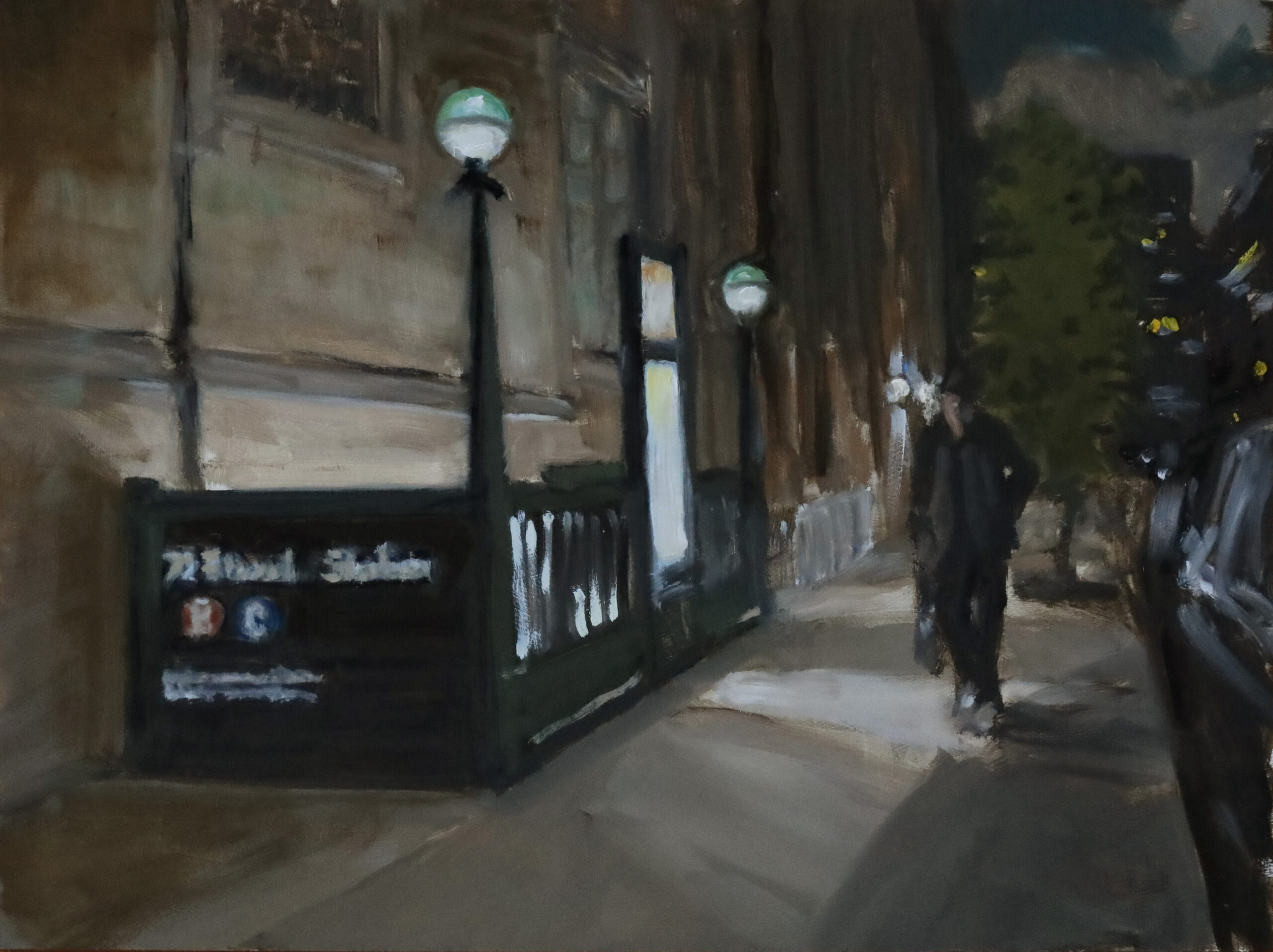
 Painting and essay by Robert Beck
After spending a quarter-century-plus logging time tethered to electronic devices, it’s easy to overlook how people used to navigate life.
Some of my favorite pieces of UWS furniture are the colored lights in front of subway stations. Those round globes set high on their dark green Subway Chic posts, with their Gotham-esque fedora, cigar, and fur-stole style, are a yo-buddy answer to the Paris Métro Nouveau entrances.
The globes were solid colors at first—green, yellow and red—letting riders know there was an agent in the station to sell tokens around the clock (green), or just during the day (yellow), or not at all (red). The red ones were known as exit-only stations, which don’t exist as such anymore.
Years later, some of the lights were given white lower halves to help illuminate the sidewalks around the entrances. Those “half-moons” added a slight mid-century modern vibe to our transit system.
There was a lot of color going on back when New York was taking the stage. Fabulous murals in residential and business lobbies. Tile work. Colored glass. Color was used to help its riders make sense of the systems, routes, and schedules. Consider that when the IRT, BMT, and IND merged in the 1940s, not all the trains fit all the tunnels and curves. Some of the 472 stations had the same names. Businesses were printing subway maps that were altered to make their establishments appear in advantageous locations. There was a lot to tie together.
We know that the routes all have identifying colors. (The 1, 2, and 3 are Pantone’s 185 red). I like that the stations’ tile color bands change at the express stop serving the local stops of that same color. If your local station is a blue-banded station (the tile color at the top of the wall, not the route), you can take an express to the first blue-band and change to a local there. My art friends will like that the early plans for the color-coding refer to colors by the names of the Berol Prismacolor pencils the designers used.
There is a huge history here. The planners, the builders, the millions of people who have ridden the subways. It’s one of those things that keeps us connected to the past, and each other, which is important. History isn’t just for museums and souvenir shops. We understand who we are by looking at who we were. How we got here. Seeing ourselves as a family of generations. Photos and glass cases aren’t the whole story.
Those globes at the subway entrances don’t tell us whether we can buy tokens anymore, but they tell the tale of a time, a need, a solution, and a certain New York style. And they still shed light.
I like looking at UWS architecture. One of my favorite rows of buildings is along the north side of West 72nd between Columbus and Amsterdam. It has some very interesting facades above the storefronts. And the Knights of Pythias building on West 71st is fabulous.
Contemporary architecture uses materials and techniques yesterday didn’t have, but each time another neutered monolith appears on the Upper West Side, such as the glass and steel citadels rising in the Lincoln Square area, we lose things of substance, like our Newyawk connection to pushcarts and laundry lines, stoops and fire escapes, and the pageantry of the sidewalks. That’s not old stuff. That’s family. It’s in the blood. Featureless concrete; that’s something else.
Note: Before Robert Beck started West Side Canvas, his essays and paintings were featured in Weekend Column. See Robert Beck’s earlier columns here and here. If you think part of the UWS fabric should be included in the West Side Canvas series, contact Robert through his website at robertbeck.net.
Subscribe to West Side Rag’s FREE email newsletter here. And you can Support the Rag here.