
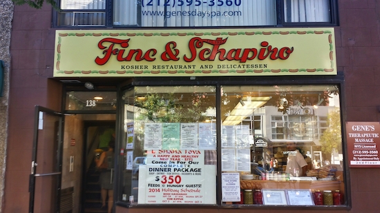
Check out the new sign at Kosher restaurant and delicatessen Fine & Schapiro, just installed last week. The spiffiest 87-year-old on the block (138 West 72nd street).
How it looks now:
How it used to look:
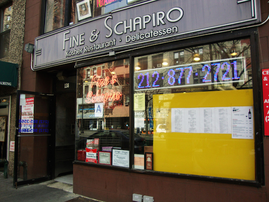
Thanks to Jeff for the photo of the new sign and MNS Real Estate for the old look.


All they need to do now is clean the inside – might require a complete demolition – and take all those papers off the window. Maybe then I’ll think about going in. How a place like this gets an A from the health inspectors is beyond me.
Overpriced and sub-par. I imagine it’ll be lauded in the comments simply for being old.
Hey, glad you guys could use the pic!
Also, my wife and I just ate here Saturday and are big fans of the pastrami. It’s $14.25 for a huge sandwich that comes with big bowls of slaw and pickles – we shared and were stuffed for under $10 apiece with tax and tip. That’s totally reasonable and by no means expensive relative to what other kosher delis would charge. F&S is no Katz’s, but it’s solid stuff.
Went here last week for take-out matzoh ball soup and there was a giant bug running around the floor of the restaurant. An employee killed it with a napkin. I won’t be going back.
What a waste of money!
A great book came out a few years ago about the loss of the traditional Jewish kosher deli.
It’s too bad the Second Avenue Deli didn’t open up on the UWS after its initial closure. All we were left with a few years ago was Lansky’s (was that the name?) and it was kosher-style, Artie’s which serves bacon and is part of a restaurant conglomerate, and the Fine & Schapiro folks who have fed this neighborhood for over eight decades.
Beggars can’t be choosers, and we don’t have many choices for Jewish deli on the UWS anymore.
They may not be considered delis but we still have Fischer Brothers & Leslie and Barney Greengrass. Both are terrific.
What a shame that they felt the need to remove the original art deco signage in favor of something more appealing to Orthodox yuppies.
Yuppies, maybe, but not so much on Orthodox for a place that’s not shomer shabbos!
Arnold, the grey-and-white sign was not the original – It had been there since the ’80s (I think the sign previous to that WAS the original). But I’m with you – if the old sign looks a bit dreary by comparison, it’s infinitely preferable and easier to read than the messy, cluttered new sign they have now.
I agree with Judy: A huge waste of money!
Here’s a photo of the original sign! The best one of all!
Hmmm…Let’s see if this link works…
https://www.flickr.com/photos/9679871@N04/8383797251/
That is indeed a beauty, Artie. Wish they’d have brought that one back.
The M-F special of soup, sandwich, dessert and drink for $14.95 is one of the best deals on the UWS. My wife and I have eaten their many time and the service and cleanliness is excellent.
Wow! Old much better design.
Crazy high prices. Cheaper to subway to LES for great food, especially soups at Neptune.
They should SO go back to the original original!
https://www.flickr.com/photos/9679871@N04/8383797251/in/photostream/
its their business decisions.
that said, nothing beats classic neon.
great old pic. thanks